Foundation of UI/UX Series 03: The Magic of Color Theory in UI Design 🎨

Welcome back to our UI/UX design series! Today, we’re diving into something truly magical: Color Theory. 🌈 This guide is your go-to resource for understanding how to pick the perfect colors for your designs. Whether you’re just starting or looking to refine your skills, this post will help you navigate the colorful world of UI design with confidence.
Let’s Get Started with Color Theory
Color is more than just what meets the eye; it’s a powerful tool in design that can evoke emotions, convey messages, and create harmony. But how do you choose the right colors? Let’s break it down.
1. What is Color Theory?
Color theory is all about understanding the relationships between colors and how they interact. It’s like a recipe for creating visually pleasing designs. The key ingredients? Hue, Tint, Tone, and Shade.
Hue: This refers to the pure color, like red, blue, or yellow. It’s the foundation of all other colors.
Tint: When you add white to a hue, you get a tint, making the color lighter and softer.
Tone: Mix a hue with gray, and you get a tone. This creates a more subdued and balanced color.
Shade: Adding black to a hue gives you a shade, making the color darker and more intense.

2. Understanding Color Models
Color models are frameworks for creating and applying color in design. Here are the big three:
RGB (Red, Green, Blue): The go-to model for anything on screens. By mixing these three colors, you can create a wide range of hues.
CMYK (Cyan, Magenta, Yellow, Black): Perfect for print. This model subtracts colors from white, reflecting how ink works on paper.
HSB (Hue, Saturation, Brightness): This model is super intuitive for designers, helping you play with color properties easily.
3. Warm vs. Cool Colors
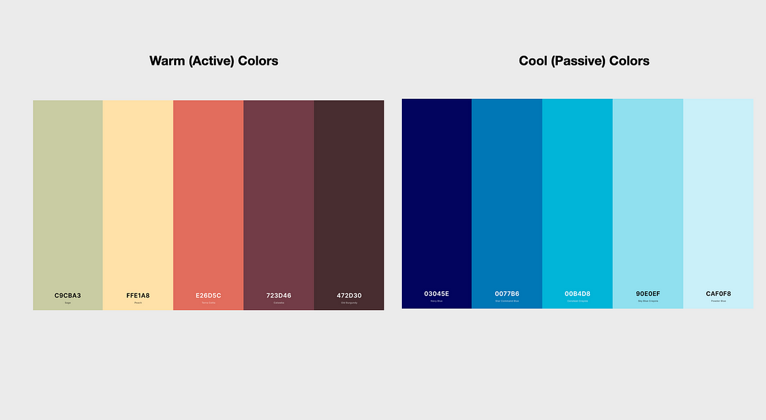
Colors are often categorized as warm or cool, each bringing its own vibe to the table.
Warm Colors (reds, oranges, yellows): These are energizing and attention-grabbing. They’re great for making elements pop but can be overwhelming if overused.
Cool Colors (blues, greens, purples): These colors are calming and trustworthy, making them ideal for backgrounds or secondary elements.
4. Building a Color Palette
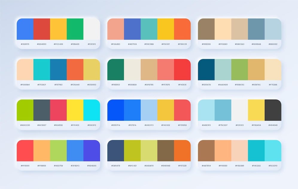
Creating a cohesive color palette is where the real magic happens. Here’s how you can craft one:
Monochromatic: Stick to one hue and vary its tints, tones, and shades. This creates a clean, elegant look.
Analogous: Choose colors next to each other on the color wheel. This approach brings harmony and a natural flow.
Complementary: Go for colors opposite each other on the wheel. It’s perfect for contrast and making elements stand out.
Triadic: Pick three colors evenly spaced on the color wheel for a balanced and vibrant palette.
5.Color categories:
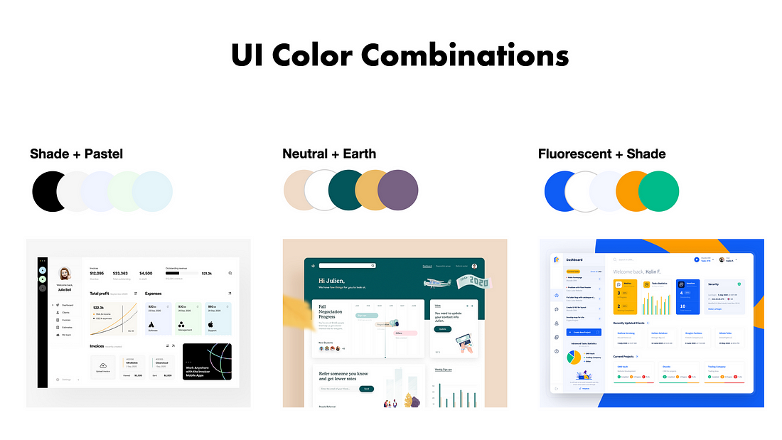
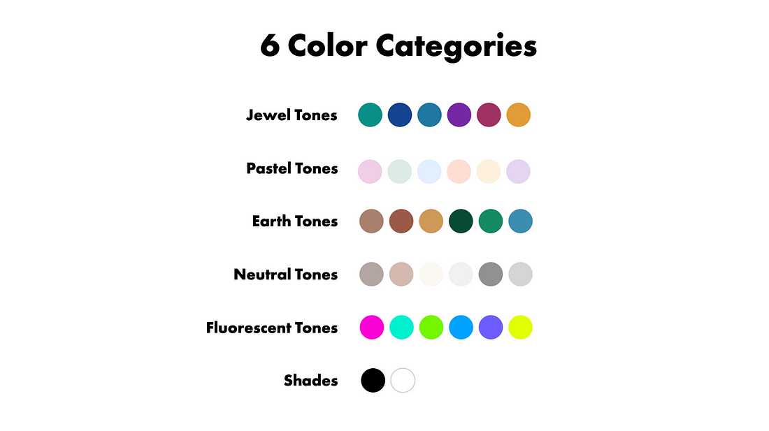
1. Jewel Tones
Definition: Jewel tones are rich, vibrant colors that resemble precious gemstones like emeralds, sapphires, rubies, and amethysts.
Characteristics: These colors are deep and saturated, often used to add a luxurious and elegant feel to designs.
Examples: Emerald green, sapphire blue, ruby red, amethyst purple.
Usage: Jewel tones are great for creating bold, eye-catching designs. They work well in branding that aims to convey sophistication and luxury.
2. Pastel Tones
Definition: Pastel tones are soft, muted colors that have been lightened by adding white to the base hue.
Characteristics: These colors are gentle, calming, and often associated with springtime or a delicate, airy atmosphere.
Examples: Baby blue, soft pink, lavender, mint green.
Usage: Pastels are commonly used in designs that aim to be soft and approachable, such as in products for children, wellness brands, or to create a sense of calm.
3. Earth Tones
Definition: Earth tones are colors that are inspired by natural elements like soil, rocks, and vegetation.
Characteristics: These colors are muted and often have a warm, grounding effect. They include a range of browns, greens, and neutrals.
Examples: Olive green, terracotta, beige, taupe.
Usage: Earth tones are ideal for creating a natural, organic feel in designs. They are often used in eco-friendly products, outdoor brands, and interiors to evoke a sense of nature.
4. Neutral Tones
Definition: Neutral tones are colors that don’t strongly lean towards any particular hue and often include shades of black, white, gray, and browns.
Characteristics: These colors are versatile and can act as a backdrop for other colors, helping to balance out a design.
Examples: Black, white, gray, beige, taupe.
Usage: Neutrals are commonly used in minimalist designs, allowing other colors to stand out, or to create a clean, sophisticated look.
5. Shades
Definition: In color theory, a shade is a pure hue with black added to it, making the color darker.
Characteristics: Shades tend to be richer and more intense, adding depth and contrast to designs.
Examples: Navy (shade of blue), maroon (shade of red), forest green (shade of green).
Usage: Shades are often used to create depth and to emphasize elements in a design. They are great for adding mood or drama to a visual presentation.
6.Fluorescent
- Fluorescent Tones: Bright, vivid colors that seem to glow with intensity. Fluorescent tones are attention-grabbing and energetic, often used to highlight important elements or convey a sense of excitement and modernity. They can add a pop of color to a design, making it stand out.
6. Applying Color Theory in UI Design
Now that you’ve got your palette, it’s time to put it to work:
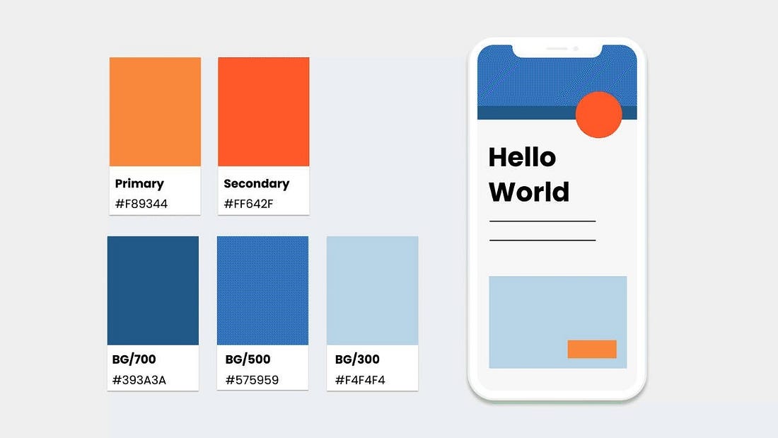
Use Contrast Wisely: Make sure text and background colors have enough contrast to be readable. It’s crucial for accessibility.
Stay Consistent: Stick to your chosen palette throughout the interface to create a seamless and professional look.
Test, Test, Test: Always test your colors in different contexts to make sure they look good and serve their purpose.
Conclusion
Color theory isn’t just about making things look pretty — it’s about creating an experience that feels right. By understanding the basics of hue, tint, tone, shade, and the various color models, you’ll be able to craft designs that are both functional and beautiful. 🎉
Ready to bring your designs to life with color? Let’s continue this journey together. And don’t forget to check out our previous post on UI Design Principles if you missed it! 😉
