Foundation Of User Interface And User Experience Series -01: ui Design Principle
Welcome to the first post in our series on the foundation of User Interface (UI) and User Experience (UX) design! In this series, we’ll be exploring various principles and practices that are essential for creating effective, user-friendly interfaces. Today, we’re diving into some core UI design principles that every designer should know: Contrast, Consistency, Typography, Color, Visual Hierarchy, and Spacing.
1. Contrast: Making Information Easy to Read
Contrast is a crucial aspect of UI design that ensures users can easily read information on the screen, regardless of whether they’re in a dark or light mode. It’s also a powerful tool for highlighting important elements like links and buttons. By using contrasting colors effectively, you can guide the user’s eye to the most important parts of your interface, ensuring a smooth and intuitive experience.
2. Consistency: Navigating with Ease
Consistency is another vital principle that helps users navigate your interface without confusion. By using the same set of colors, typography, spacing systems, and icons throughout your design, you create a cohesive experience that feels intuitive and reliable. Consistency reduces the learning curve for users, making your UI easier to use and understand.

3. Typography: The Art of Text in UI Design
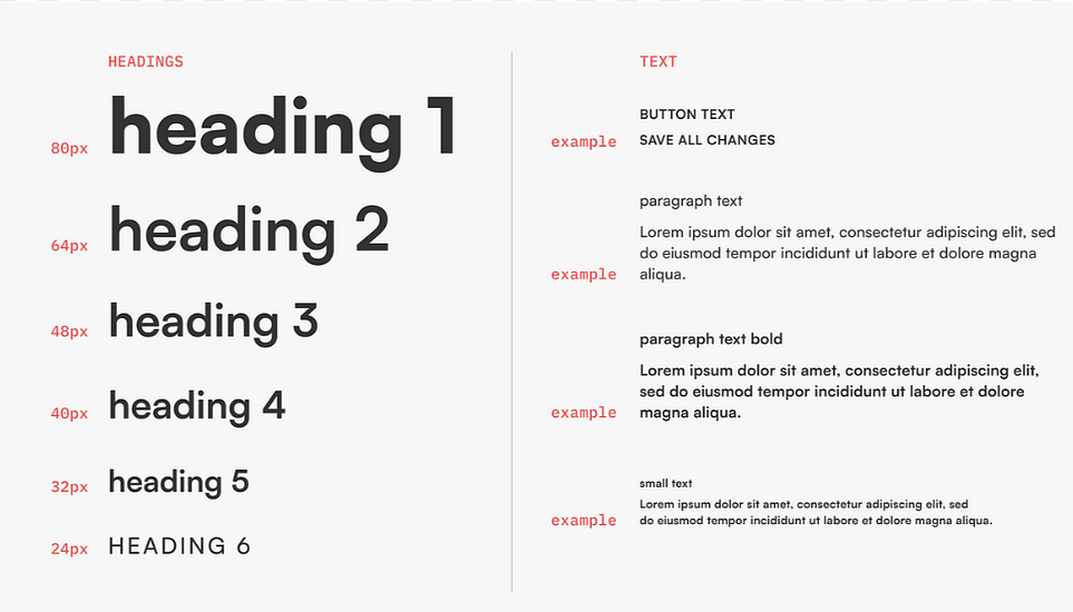
Typography plays a significant role in how professional and polished your interface appears. The right typography can enhance readability, convey the personality of your brand, and establish a clear hierarchy within your content. Here are five important notes on typography:
Readability: Ensure that your text is easy to read at various sizes.
Personality: Choose fonts that reflect the tone and style of your brand.
Size and Hierarchy: Use font sizes to create a clear hierarchy, guiding users’ attention from headings to body content.
Limit the Number of Typefaces: Stick to two typefaces — one for headings and another for body content — to maintain a clean and cohesive look.
Hierarchy: Utilize font weight, size, and style to establish a visual hierarchy that leads the user through your content naturally.

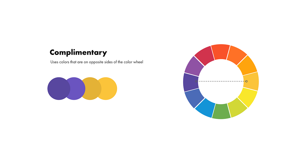
4. Color: Setting the Mood
Color is not just about aesthetics; it plays a crucial role in the usability and emotional impact of your design. Choosing the right colors can help convey your brand’s personality, evoke specific emotions, and improve the overall user experience. Bright and saturated colors tend to grab attention, while softer tones can be used to create a calming effect.

5. Visual Hierarchy: Guiding the User’s Eye
Visual hierarchy is all about guiding the user’s attention to the most important elements on the screen first. By organizing elements according to their importance, you can ensure that users notice what you want them to see. Larger elements, bold text, bright colors, and unique alignments naturally draw the eye, helping to create a clear path for users to follow through your interface.

6. Spacing: The Power of Empty Space
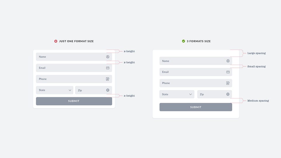
Spacing is often underestimated, but it’s just as important as the actual content in your design. Proper use of spacing can make your UI look more professional, clean, and easy to navigate. It enhances visual hierarchy, ensuring that your design doesn’t feel cluttered. Key terms to know in spacing are:
Padding: The space between the content and the border of an element.
Margin: The space between different elements in your design.

By mastering these principles, you’ll be well on your way to creating user interfaces that are not only visually appealing but also functional and user-friendly. Stay tuned for the next post in our series, where we’ll dive deeper into more UI/UX design concepts. Happy designing!
